

November 14, 2009
Jesus Christ Superstar Poster
We're putting on Jesus Christ Superstar in Concert during my winter break at home and I found some time last week to do the poster. I haven't put the times on yet but I'm pretty happy with how it turned out. I did things a little differently than usual. I Jo Chen at Baltimore's Comic Con and she talked a little about her style and how she uses digital media. I did a little more research later and found a tutorial of hers and I tried out her process. I have to say that I enjoyed it and I might continue working that way for a little while.


November 6, 2009
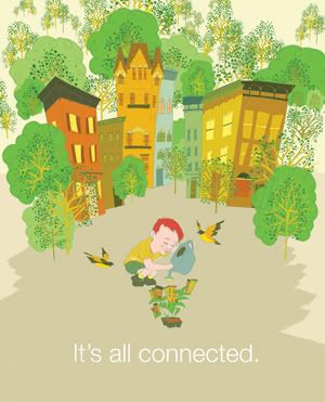
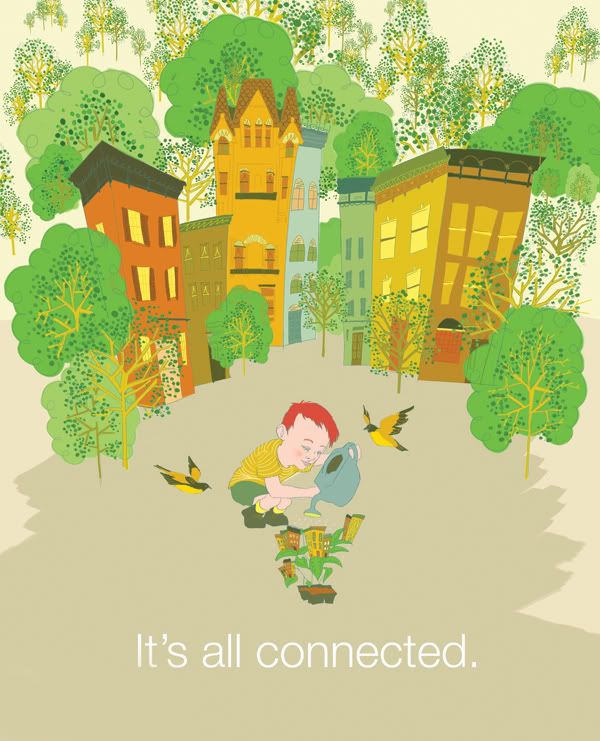
Sustainability Poster
The Illustration department had all the juniors design a sustainability poster for Cleaner Greener Baltimore. Of course they're all cute and colorful and completely different from everything else we do.
October 21, 2009
Patterns Revised
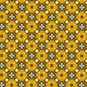
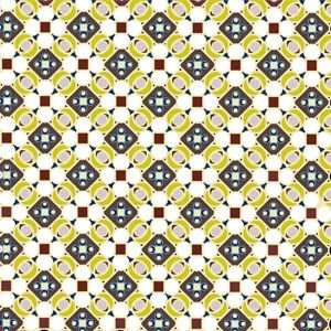
I revised some of the patterns I did for my Type class and I think the came out a lot better this time. I was not happy with all of them before.
I'm still trying to get pictures up of my project for The Lab. Hopefully those will be up soon.
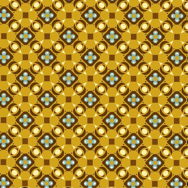
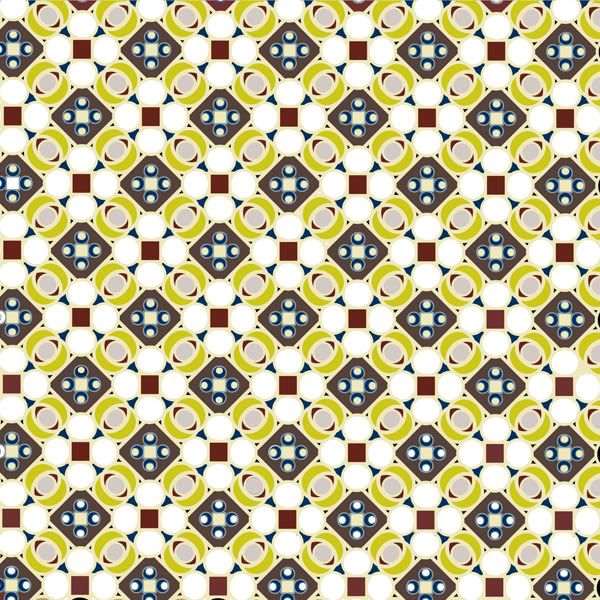
I'm still trying to get pictures up of my project for The Lab. Hopefully those will be up soon.
October 13, 2009
Palettes
I'm in a DIY class where we have to make a product and sell it MICA's Art Market in December. I've been making little masks to put on pins, necklaces and headbands and I'd like to post pictures of my progress but my camera is dumb. Hopefully I'll get it working soon and I'll have some things to show. We've been doing some letterpress and Gocco in class and I got to Gocco my logo onto little tags for my pieces.
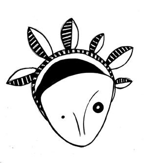
I'll post full pictures of the tags later.
I'm going to Jo-Ann's tomorrow to buy more fabric because I don't like the colors I picked last time. So to make sure I don't waste money I made several color combinations and then made a palette with the colors I want to purchase. I then numbered how many times each color appears in my combinations so that I know which ones are the most important to buy in case I have to cut back.
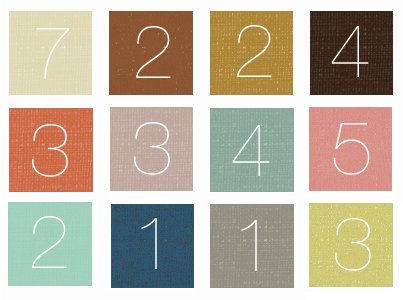
I like the way this looks. I'd love to make a poster of this. It reminds me of a skin project we did freshmen year where we had to pick out as many colors as we could in our skin and create something with them. I wish I had done this. Maybe I will in my spare time. I've got some extra money on my flex account this year so I could splurge at the print lab. Oh how I love the print lab. It's so satisfying to print.
I'll post full pictures of the tags later.
I'm going to Jo-Ann's tomorrow to buy more fabric because I don't like the colors I picked last time. So to make sure I don't waste money I made several color combinations and then made a palette with the colors I want to purchase. I then numbered how many times each color appears in my combinations so that I know which ones are the most important to buy in case I have to cut back.
I like the way this looks. I'd love to make a poster of this. It reminds me of a skin project we did freshmen year where we had to pick out as many colors as we could in our skin and create something with them. I wish I had done this. Maybe I will in my spare time. I've got some extra money on my flex account this year so I could splurge at the print lab. Oh how I love the print lab. It's so satisfying to print.
October 6, 2009
Patterns with Type
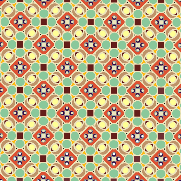
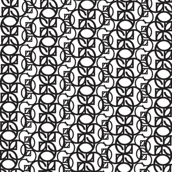
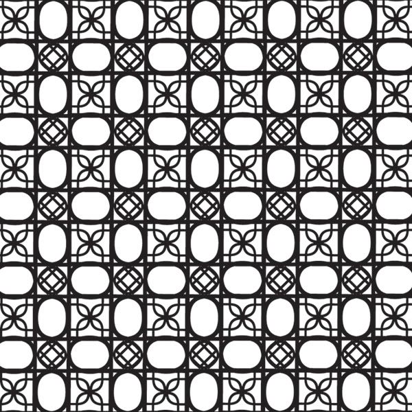
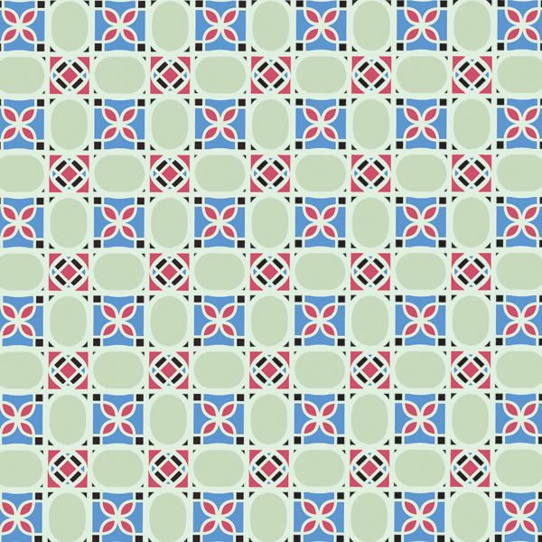
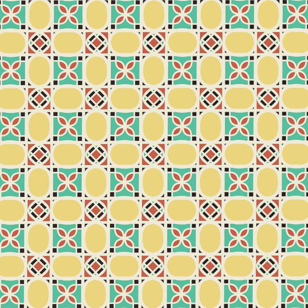
In my type class, which is sometimes extremely painful, we had to create patterns using a single letter from a single font. First our patterns were executed in black and white and then later translated into color. I made two color versions for each pattern. Here's my series:
A lowercase A in Futura


An uppercase G in Helvetica
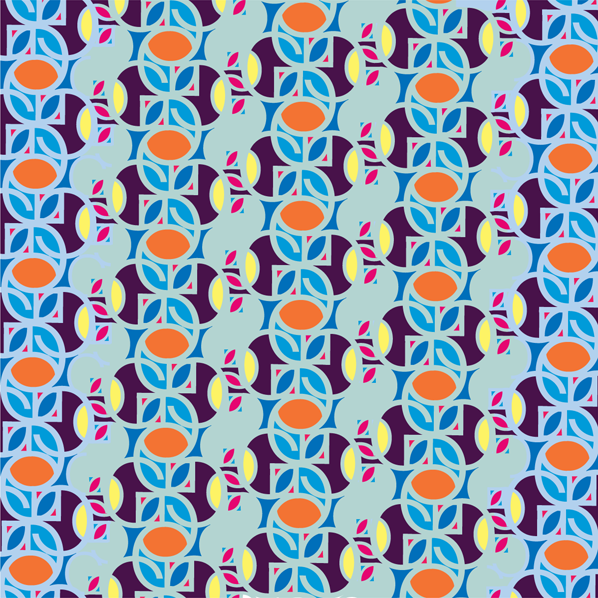
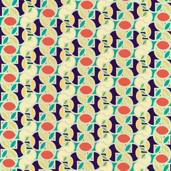
A uppercase D in Helvetica
September 27, 2009
Ballet Boy
For our second Illustration Concepts assignment we had to illustrate another classmate's child story. Here's mine:
I decided not to draw any scene literally. Instead, I tried to capture Tyler in a more "subconscious" state. At first I tried putting him in the pink tights and leotard but it made the image seem too humorous. I'm hoping that the tutu over the clothing isn't quite so bad.
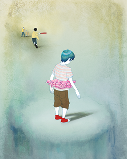
This piece was drawn, then scanned and colored in Adobe Photoshop CS3.
"My sisters and I were the only girls living on my block while we were growing up, and if you wanted to play with the neighborhood boys you had to be good at sports. Over time though, I became best friends with a boy named Tyler. Tyler's dad was extremely sexist; and every time I went to Tyler's house we had to play video games or sports. But, when Tyler came to my house we would play barbies and put on plays. Games his dad deemed unfitting for a boy. One day my sister decided that we would all put on a performance of the "Nutcracker". So we all put on tights and leotards (including Tyler) and threw on the soundtrack to the Nutcracker. As we are all whirling and dancing to the music, Tyler's dad walks into our living room and seeing his first born son in pink tights and a black leotard, he decides to throw a fit. He dragged Tyler out of our house still wearing the ballet clothes. We weren't allowed to play with him for a week, and Tyler never played anything he considered "girly" again.
I decided not to draw any scene literally. Instead, I tried to capture Tyler in a more "subconscious" state. At first I tried putting him in the pink tights and leotard but it made the image seem too humorous. I'm hoping that the tutu over the clothing isn't quite so bad.
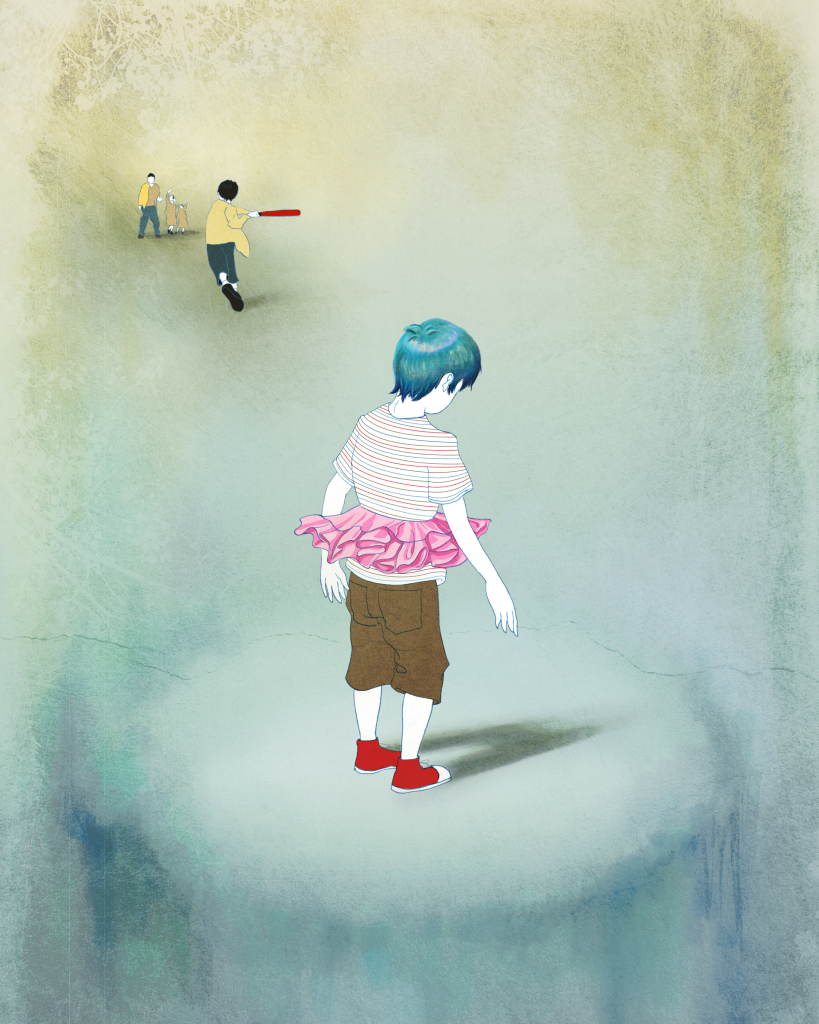
This piece was drawn, then scanned and colored in Adobe Photoshop CS3.
September 23, 2009
Mermaid
My Illustration III class for this semester is called "Illustration Concepts". For our first assignment we had to pick a worldly topic(mine was plastic surgery) and illustrate it using a mythological creature.
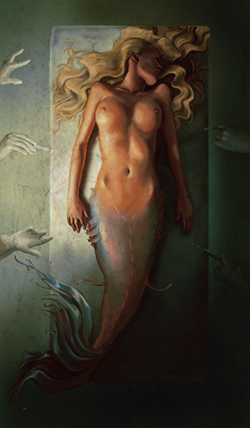
In class, my teacher informed me that it wasn't exactly creepy like I wanted it to be and the girl was by far too "pretty". He suggested some alterations so the next week I came in with an updated piece.
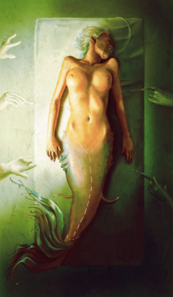
After making the changes and looking at it I agree with what he said. I changed the lighting to be greener and with more contrast, it's a little stereotypical for this kind of image but I do like it.
This piece was first drawn in pencil then scanned and painted completely in Photoshop CS3. A texture was added as well.

In class, my teacher informed me that it wasn't exactly creepy like I wanted it to be and the girl was by far too "pretty". He suggested some alterations so the next week I came in with an updated piece.
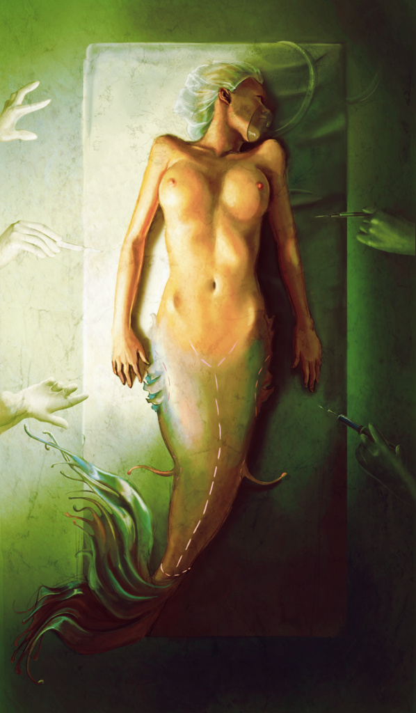
After making the changes and looking at it I agree with what he said. I changed the lighting to be greener and with more contrast, it's a little stereotypical for this kind of image but I do like it.
This piece was first drawn in pencil then scanned and painted completely in Photoshop CS3. A texture was added as well.
Subscribe to:
Posts (Atom)